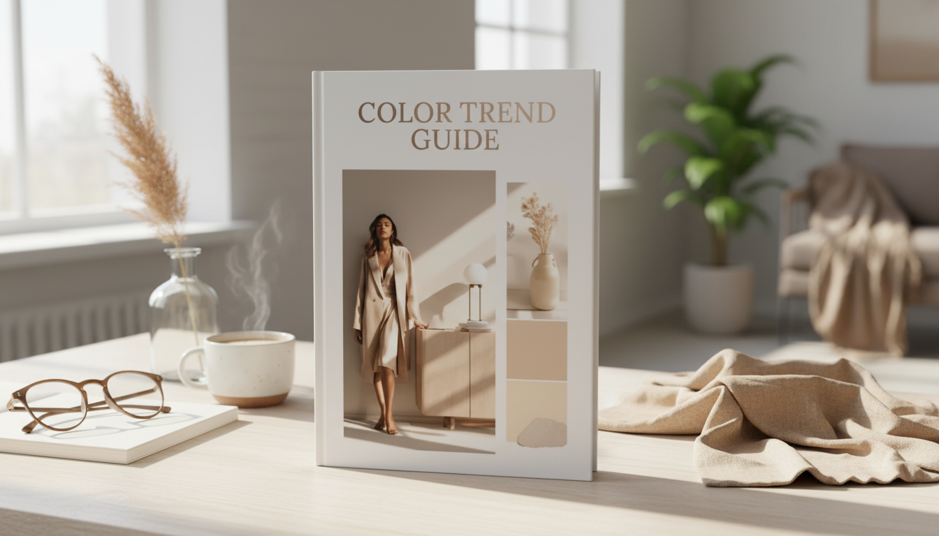
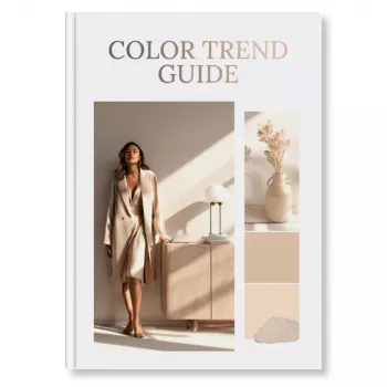
A practical color trend guide can turn scattered inspiration into confident palette decisions across branding, campaigns, and creative work. This digital download eBook organizes trend direction into usable color stories and shows how to apply them with clarity—so visuals feel current without losing brand consistency.
Color trends move fast, but most teams don’t need more color—they need a reliable way to decide. A structured guide helps turn “we like it” into “we can use it,” with clear reasons behind each palette choice.
This eBook is designed to be used mid-project—during planning, design, or revisions—when you need direction quickly and want to avoid starting over.
For teams that reference established standards and trend authorities, it pairs naturally with resources like the Pantone Color Institute and practical tools like the Adobe Color Wheel.
Trend forecasting doesn’t have to be mysterious. A repeatable workflow makes it easier to explain decisions, maintain consistency, and update palettes without reinventing your entire visual system.
For digital-first design, contrast checks are non-negotiable—especially for small text, buttons, and overlays. The W3C WCAG overview is a helpful benchmark when building accessible color systems.
The goal isn’t to chase every new hue—it’s to integrate modern palettes in a way that still feels unmistakably “you.” Trend colors work best when they’re treated as a layer on top of strong brand foundations.
| Color role | Best used for | Quick rule to keep it cohesive |
|---|---|---|
| Primary | Brand headers, key surfaces, hero sections | Use consistently; limit to 1–2 primary tones |
| Secondary | Supporting blocks, charts, UI components, backgrounds | Stay adjacent in temperature (warm/cool) to the primary |
| Accent | Buttons, highlights, promo tags, key icons | Use sparingly; reserve for priority actions and focal points |
| Neutral base | Backgrounds, whitespace, product shots, typography support | Choose neutrals that flatter skin tones/products and reduce noise |
| Text/Contrast | Body copy, captions, data labels | Prioritize legibility; confirm contrast across devices |
Color decisions show up everywhere—brand systems, templates, photography backdrops, even how a call-to-action reads at a glance. This guide is built for real-world creative output, not just inspiration boards.
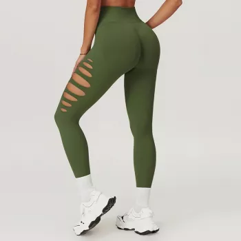
For example, a bold accent can frame product moments cleanly—whether you’re styling a launch around sporty textures like High-Waist Scrunch Leggings for Women or leaning into warm seasonal color stories with Liu Jo Women’s Orange Linen-Blend Shorts. A quieter neutral base can support elevated, minimal visuals for pieces like Ichi Women’s Grey Long Sleeve Dress – Elegant Slip-On Dress for Spring/Summer.
When time is tight, a simple checklist keeps color decisions consistent across deliverables and prevents “one-off” designs that don’t match the campaign system.
If you want a structured, practical eBook for turning trend direction into usable palettes and clear application rules, start here: Color Trend Guide | Digital Download | eBook for Designers, Marketers & Creatives.
A trend guide provides context—why a palette matters, what mood it communicates, and how to apply it across real assets. Palette generators can output combinations quickly, but they typically don’t include rationale, themes, or usage rules.
Yes—use trend colors as seasonal accents, or adjust saturation/temperature while keeping core brand anchors stable. Controlling proportion (and where the trend color appears) helps keep recognition intact.
Check contrast and legibility, consistency across formats, accessibility considerations, and how colors behave on different screens versus print. Assign clear roles (primary/secondary/accent) so each color has a purpose.


Leave a comment